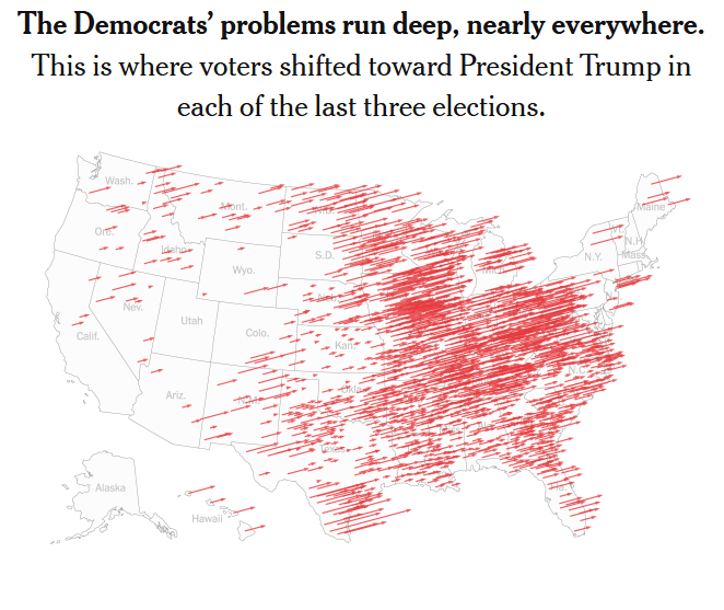
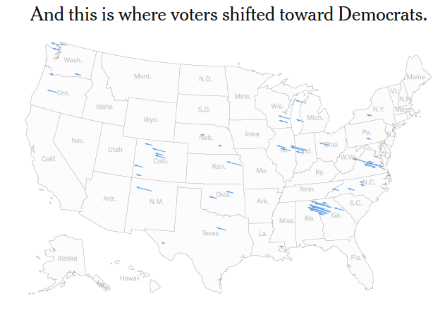
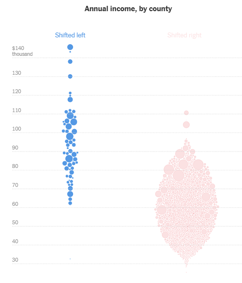
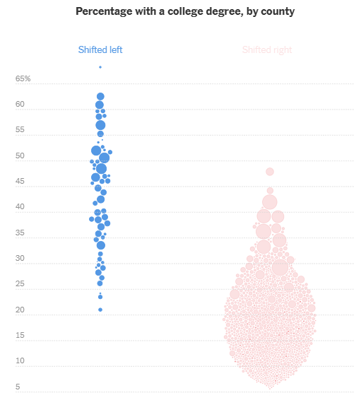
Here is a neat NYT article, May 2, 2025 looking at the counties that consistently shifted left or right over the last three elections: Trumps first win, Biden’s win and Trump’s second term. Net: Great visuals to show the Republican’s strong connection to the working class all across the country. Here are graphics from the visual article.
So many changes, so many days! What are the tariff values today? When did they change?
The Peterson Institute for International Economics popped up in a Google search. Looks like they have all the details. Well-organized charts and a list of changes going back to 2018 (Just 2025 changes are shown below.) Enjoy!
I describe YCharts as a massive data lake with a subscription-based interface.
YCharts describes itself, “A powerful, flexible, and time-saving platform empowering growth for both your clients & your business.”
They sent me their 2024 Economic Data deck with the message, “Use these visuals about important investing concepts in your own presentations; share with clients, prospects, colleagues, or followers online!” So here are just a few of the charts contained in it. Here is their .pdf and PowerPoint version.
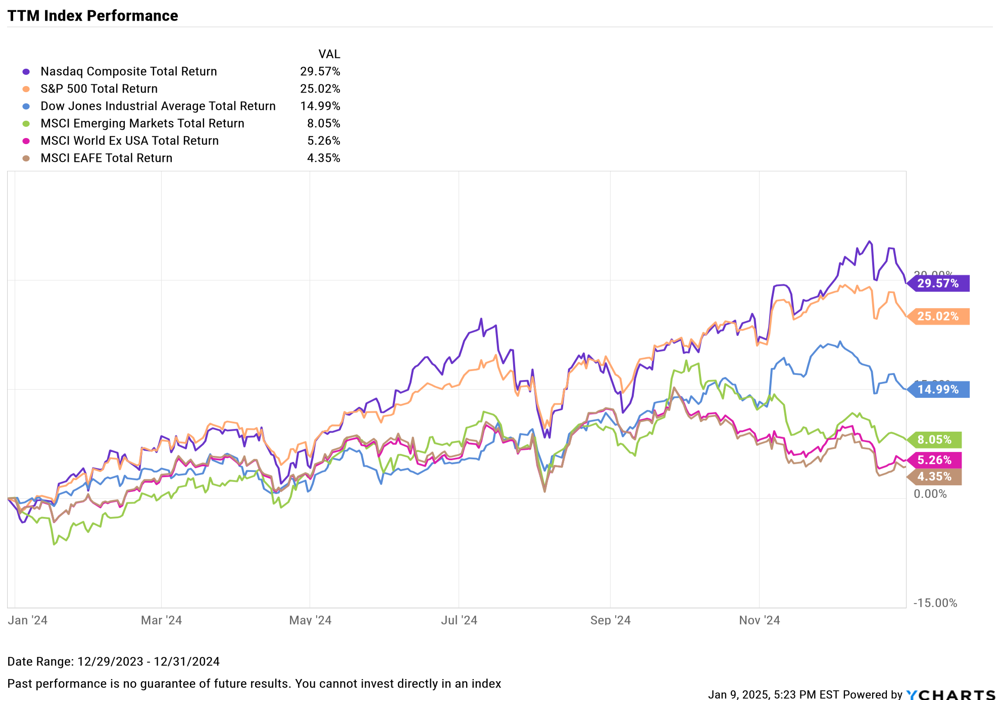
TTM Index Performance, 2024 – Stock investments did really well.
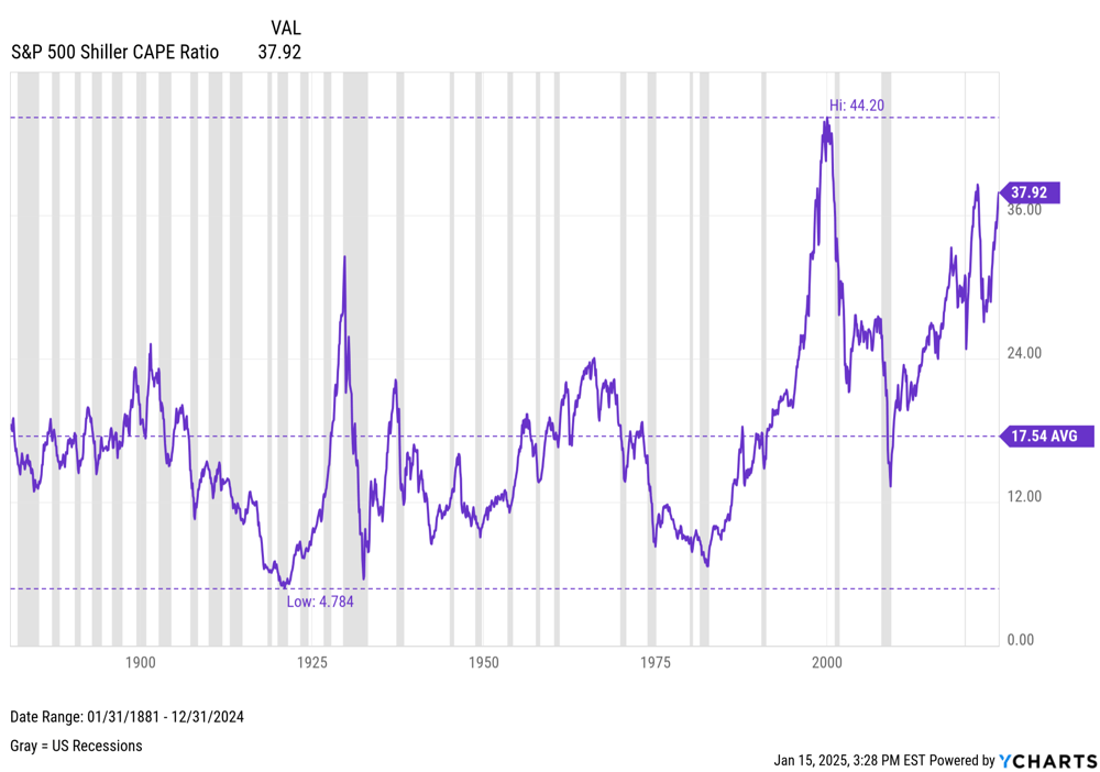
S&P 500 Shiller CAPE Ratio – From across the decades – Stocks are a bit over valued. I would say about 24-26 would be ‘normal’
Inflation and CPI – The post-pandemic inflation was the first run up in several decades.
Employment – The post pandemic boom time for jobs slowed back to ‘normal’, though the US Labor Force Participation Rate never recovered: Generally assumed to be Baby Boomers retiring and people with Long Covid.
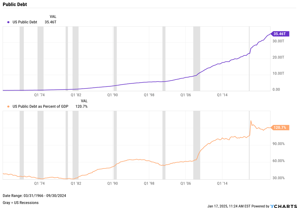
GDP & Public Debt – Two sets of Charts: 1) The US has a tremendous amount of Debt, and 2) Coming out of the 2008-2010 Great Recession moved it toward 100% of US Annual GDP. Coming out of the Pandemic moved it to 120% of US Annual GDP.
Consumers Savings and Credit – Two sets of charts, 1) US Consumers saved money during the Pandemic shutdown, then promptly spent it after the world opened back up. 2) Sales YoY after inflation picked up have been soft and Consumer Sentiment dropped as if there was a recession.
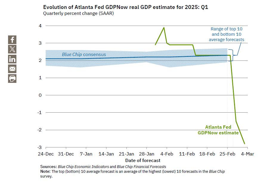
Just saw this crazy economic projection on Marc Cuban’s BlueSky, so I found it’s source: Atlanta FED’s GDPNow economic projection. It’s real. The chart below is the current Atlanta FED’s GDP Now economic projection – they have doubled down in the meantime.
Either the gurus at the Federal Reserve Bank are off, or the market is being slow to realize the economy is changing.
The recent Speaker of the House elections turned the nation’s focus to the US House. How could a representative’s voting be tracked monthly with a few metrics?
How about two metrics?
Percent Conservative (vote the same as Lauren Boebert), and
Percent Liberal (vote the same as AOC)
Here is a video taking these metrics from concept to initial numbers for my US House Rep.
Hint: It works well for Yes/No votes. I found a blind spot – when Rep. Boebert, AOC and my representative all vote differently. What are your thoughts’?
Standard way to present increasing mortgage interest rates:
A $500K home, 30-year mortgage, 100% down (second chart)
at 3.5% monthly payment = $2,245
at 6.5% monthly payment = $3,327
Net: Buyer needs to find more money for monthly payment
Closer to the truth: a home buyer has talked to a banker prior to purchase and has a maximum monthly payment in hand.
How has the home purchase amount changed with a set monthly payment?
A $2,200 monthly payment, a buyer can purchase:
With 3.5% interest, purchases a $500K home
With 6.5% interest, purchases a $355K home
So this 3.0 point rise in mortgage interest rates, lowers the home value that can be purchased by 29% with all other variables around a home purchases staying fixed. This is the point the commentator made regarding lowering home values. Most people cannot simply increase their monthly payment to purchase a home.