
I describe YCharts as a massive data lake with a subscription-based interface.
YCharts describes itself, “A powerful, flexible, and time-saving platform empowering growth for both your clients & your business.”
They sent me their 2024 Economic Data deck with the message, “Use these visuals about important investing concepts in your own presentations; share with clients, prospects, colleagues, or followers online!” So here are just a few of the charts contained in it. Here is their .pdf and PowerPoint version.
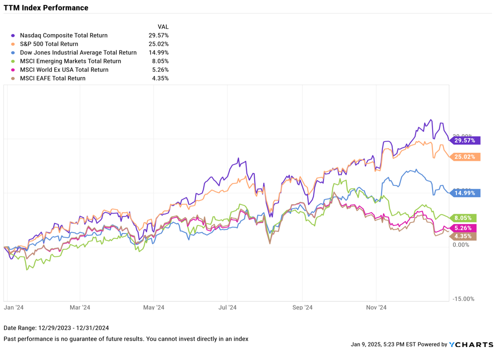
TTM Index Performance, 2024 – Stock investments did really well.
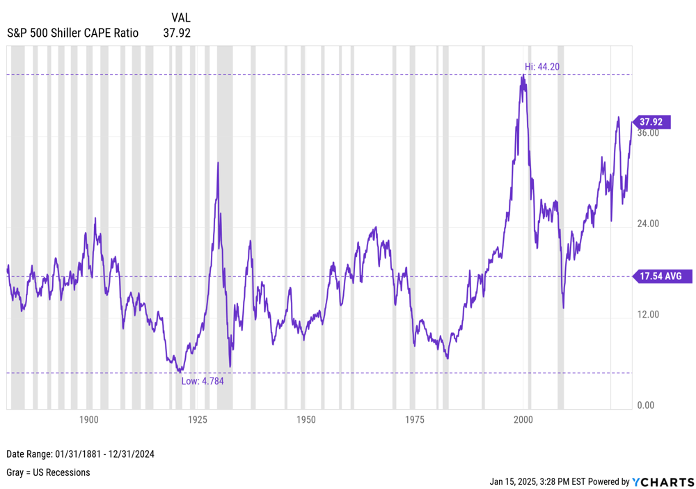
S&P 500 Shiller CAPE Ratio – From across the decades – Stocks are a bit over valued. I would say about 24-26 would be ‘normal’
Inflation and CPI – The post-pandemic inflation was the first run up in several decades.

Employment – The post pandemic boom time for jobs slowed back to ‘normal’, though the US Labor Force Participation Rate never recovered: Generally assumed to be Baby Boomers retiring and people with Long Covid.

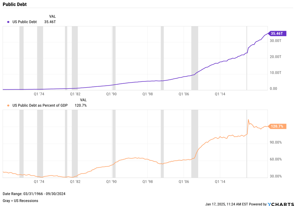
GDP & Public Debt – Two sets of Charts: 1) The US has a tremendous amount of Debt, and 2) Coming out of the 2008-2010 Great Recession moved it toward 100% of US Annual GDP. Coming out of the Pandemic moved it to 120% of US Annual GDP.

Consumers Savings and Credit – Two sets of charts, 1) US Consumers saved money during the Pandemic shutdown, then promptly spent it after the world opened back up. 2) Sales YoY after inflation picked up have been soft and Consumer Sentiment dropped as if there was a recession.


