Skip to content

Josh's Blog

  • Home
  • Blog
  • Contact
Skip to content

Josh's Blog

Expectations for 2025: Explaining with Data

Data Analysis

Data Science Heart !

Posted on January 3, 2020January 3, 2020 by Josh Welch in Data Analysis

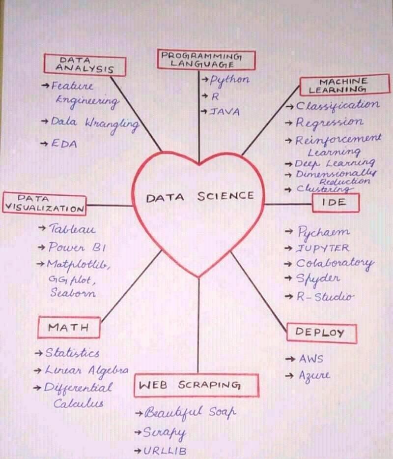
The best graphics are often elegant in their simplicity of displaying complexity. Such as this one by Nabih Ibrahim Bawazir posted this diagram on LinkedIn 1/1/2020 with credit to Shahanka M. Perhaps Excel could be listed on it.
DataScienceHeart.jpg

Share this:

  • Click to share on X (Opens in new window) X
  • Click to share on Facebook (Opens in new window) Facebook
Like Loading...

Related

Post navigation

Previous post2019 in Review: Week by Week
Next postAirbnb & New Portland Licenses in 2020
Blog at WordPress.com.
  • Reblog
  • Subscribe Subscribed
    • Josh's Blog
    • Already have a WordPress.com account? Log in now.
    • Josh's Blog
    • Subscribe Subscribed
    • Sign up
    • Log in
    • Copy shortlink
    • Report this content
    • View post in Reader
    • Manage subscriptions
    • Collapse this bar
 

Loading Comments...
 

    %d